- Advanced Analytics
- Azure
- Big Data
- Business Intelligence
- Data Analytics
- Data Lake
- Data Warehouse
- Databricks
- DAX
- DWH Automation
- Information Design
- Internet of Things (IoT)
- Künstliche Intelligenz
- Power BI
- Process Mining
- Reporting
- SAP
- Self-Service BI
- SQL Server
- Agiles Projektmanagement
- Azure Synapse Analytics
- Cloud
- Dashboard
- Data Driven Company
- Data Science
- Datenintegration
- Datenmanagement
- Datenqualität
- Digitalisierung
- Echtzeitanalyse
- Machine Learning
- Robotic Process Automation (RPA)
- Modern Data Warehouse
- Data Analytics Platform
- Power Platform
- Data Mesh
- Data Sustainability
- Datenstrategie
- Celonis
- Confidential Computing
- DATA + AI World
- Data Driven Company
- data governance
- Data Mesh
- Data Strategy
- KI
- Microsoft
- Microsoft Fabric
- Partner
- Process Mining
- Prozessoptimierung
- Recap
- Retail
- SQL
- SQL Konferenz
- Databricks Streaming
- Datenanalyse
- Echtzeitdaten
- Real-Time data
15.07.2025 Lukas Lötters
Large Language Models – Wie Sie Ihr eigenes ChatGPT aufbauen
Ob „ogGPT“ von OTTO, Mercedes mit dem „Direct Chat“ oder auch das „dmGPT“ – immer mehr Unternehmen nutzen LLMs für den Aufbau eines Firmen-Chatbots. Aber wie …
20.05.2025 Nils Kux
Microsoft Fabric vs. Power BI: Der ultimative Vergleich für Ihre Datenanalyse
In einer zunehmend datengetriebenen Geschäftswelt rückt die Frage nach der richtigen Analytics-Plattform immer stärker in den Fokus. Viele Unternehmen stehen aktuell vor …
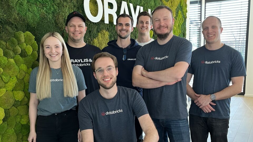
30.04.2025 Michael Schmahl
ORAYLIS ist Databricks Consulting Partner Elite
ORAYLIS ist jetzt Databricks Consulting Partner Elite. Dadurch können wir unsere Kunden bei ihren Projekten noch effektiver unterstützen . …
31.03.2025 Lasse Jenzen
Datenplattformen automatisieren: DataM8 spart Zeit, Kosten & Know-how
Mit dem kostenfreien DataM8 können Unternehmen ganz nach ihren Vorstellungen Abläufe automatisieren und über die gesamte Prozesslandschaft hinweg Effizienzsteigerungen …
20.03.2025 Christoph Epping
Approaching Industry 4.0 with Databricks Streaming: Best Practices from an Implementation Perspective
Real-time data is considered to be one of the most valuable treasure troves for companies. Thanks to modern cloud-based technologies, it is now finally possible to fully …
20.03.2025 Christoph Epping
Industrie 4.0 mit Databricks Streaming: Best Practices aus der Implementierung
Echtzeitdaten gehören zu den besonderen Unternehmensschätzen, die sich dank moderner Cloud-Technologien endlich umfassend erschließen und in geschäftliche Analysen …
07.02.2025 Dennis Loh-Mandrella
Azure Synapse vs. Microsoft Fabric: Ein Vergleich der modernen Datenplattformen
Die Verarbeitung und Analyse von Daten ist für Unternehmen jeder Größe von zentraler Bedeutung. Microsoft bietet mit Azure Synapse Analytics und Microsoft Fabric zwei …
07.02.2025 Nils Kux
Power BI Preiserhöhung 2025: Was Unternehmen jetzt wissen sollten
Im April 2025 wird Microsoft die Preise für Power BI Pro und Premium pro Nutzer erhöhen. Diese Änderungen könnten die Datenstrategie vieler Unternehmen beeinflussen. …
22.11.2024 Insa Menzel
Nachhaltige Lieferketten mit Process Mining
Process Mining führt im Vergleich zu Künstlicher Intelligenz und dem Internet of Things eher ein Schattendasein, wenn es um die Erschließung von …
10.10.2024 Julian Krüger
Data Vault: Datenmodellierung für zukunftssichere Cloud-Plattformen
Die Anforderungen an moderne Cloud-Plattformen sind vielfältig. Eine Datenmodellierung mit Data Vault sorgt für die erforderliche Skalierbarkeit, Performance und …
02.10.2024 Michael Schmahl
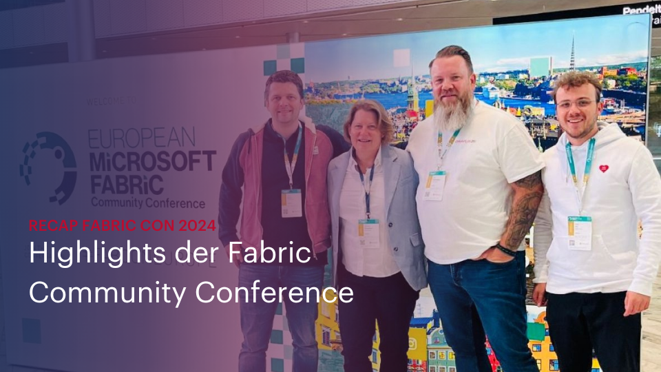
Recap FabCon 2024: Highlights der Microsoft Fabric Community Conference
Microsoft hat zur ersten Fabric-Konferenz nach Stockholm gerufen. Als frischgebackener Fabric Featured Partner sind wir dem selbstverständlich gefolgt. Unser vierköpfiges …
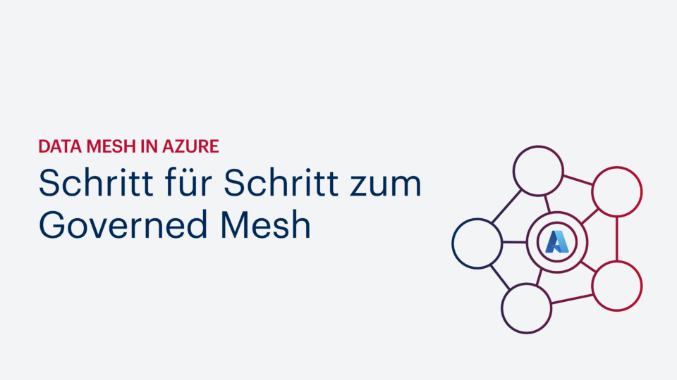
03.09.2024 Kevin Letellier
Data Mesh in Azure – Schritt für Schritt zum Governed Mesh
Wie können Sie in Azure Ihren ersten Data Mesh umsetzen? Unser Experte zeigt Ihnen Schritt für Schritt, wie Sie vorgehen sollten. …