- Zertifizierung
- ISO 27001
- Künstliche Intelligenz
- KI im Unternehmen
- Agentic AI
- KI Agenten
- Advanced Analytics
- Azure
- Big Data
- Business Intelligence
- Data Analytics
- Data Lake
- Data Warehouse
- Databricks
- DAX
- DWH Automation
- Information Design
- Internet of Things (IoT)
- Künstliche Intelligenz
- Power BI
- Process Mining
- Reporting
- SAP
- Self-Service BI
- SQL Server
- Agiles Projektmanagement
- Azure Synapse Analytics
- Cloud
- Dashboard
- Data Driven Company
- Data Science
- Datenintegration
- Datenmanagement
- Datenqualität
- Digitalisierung
- Echtzeitanalyse
- Machine Learning
- Robotic Process Automation (RPA)
- Modern Data Warehouse
- Data Analytics Platform
- Power Platform
- Data Mesh
- Data Sustainability
- Datenstrategie
- Celonis
- Confidential Computing
- DATA + AI World
- Data Driven Company
- data governance
- Data Mesh
- Data Strategy
- KI
- Microsoft
- Microsoft Fabric
- Partner
- Process Mining
- Prozessoptimierung
- Recap
- Retail
- SQL
- SQL Konferenz
- Databricks Streaming
- Datenanalyse
- Echtzeitdaten
- Real-Time data
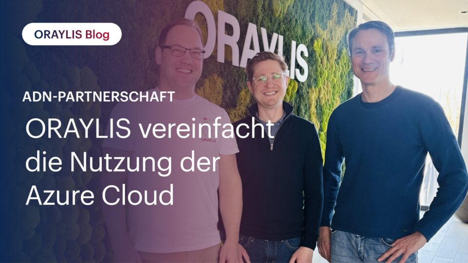
11.05.2026 Michael Schmahl
ADN-Partnerschaft: ORAYLIS vereinfacht die Nutzung der Azure Cloud
ORAYLIS und ADN Distribution sind nun Partner. Unternehmen können dadurch die Services der Azure Cloud direkt bei ORAYLIS beziehen und in vollem Umfang von Microsofts …

11.05.2026 David Claßen
Microsoft Preisanpassungen 2026: So optimieren Sie Ihre Kosten
Das Jahr 2026 zeichnet sich für Microsoft-Kunden durch ein außergewöhnliches Zusammenspiel von Preisbewegungen aus: Einerseits wurde zum 1. Februar eine …

06.05.2026 Thomas Höllen
KI-Agenten: Was sie sind und wie man sie erfolgreich einsetzt
KI-Agenten sind Systeme, die eigenständig Ziele verfolgen, Aufgaben planen und mithilfe von Tools, Daten und Anwendungen ausführen können. Sie erweitern klassische …
24.04.2026 Insa Menzel
Datenkultur: Warum die beste Strategie ohne den „Faktor Mensch“ scheitert
Es gibt ein berühmtes Zitat von Peter Drucker: „Culture eats strategy for breakfast.“ Im Kontext der Digitalisierung bedeutet das: Sie können die präziseste Roadmap …
18.03.2026 Insa Menzel
Ohne Datenstrategie keine Data & AI Driven Company: So gelingt der Einstieg
Dashboards gibt es viele. Erkenntnisse wenige. In zahlreichen Unternehmen werden Daten gesammelt, analysiert und visualisiert und dennoch bleibt der erhoffte Einfluss auf …

25.02.2026 Dennis Loh-Mandrella
Fabric Mirroring: Wie Sie SAP-Daten effizient einbinden und nutzen
SAP-Daten lassen sich in Microsoft Fabric schnell und unkompliziert für die unternehmensweite Datenanalyse bereitstellen. Grundlage bildet hierbei eine Kombination aus SAP …

02.02.2026 Lasse Jenzen
KRITIS-Gesetz: Confidential Computing als Schlüsselelement für den IT-Schutz
Anfang 2026 tritt für die Betreiber kritischer Infrastrukturen (KRITIS) in Deutschland das Dachgesetz für den Schutz und die Resilienz von Anlagen und Systemen in Kraft. …
14.10.2025 Insa Menzel
EU AI Act: Was Unternehmen jetzt wissen und vorbereiten sollten
Mit dem EU AI Act hat die Europäische Union im März 2024 das erste umfassende Gesetzespaket für Künstliche Intelligenz weltweit verabschiedet. …
13.10.2025 Martin van Husen
EU Data Act: Mehr Kontrolle und neue Chancen im Umgang mit Daten
Mit dem EU Data Act hat die Europäische Union im Juni 2023 ein zentrales Gesetzespaket auf den Weg gebracht, das den Umgang mit Daten in Europa grundlegend verändern …

19.09.2025 Christian Lause
Power BI Updates September 2025: Die Features im Überblick
Alle wichtigen Power BI Updates vom September 2025: Von DAX User Defined Functions und Time Intelligence bis hin zu Copilot und der Kombination aus Direct Lake und Import …

19.09.2025 Michael Schmahl
ISO 27001: ORAYLIS erfüllt „Gold-Standard“ für Informationssicherheit
ORAYLIS ist jetzt Databricks Consulting Partner Elite. Dadurch können wir unsere Kunden bei ihren Projekten noch effektiver unterstützen . …

15.07.2025 Lukas Lötters
Large Language Models – Wie Sie Ihr eigenes ChatGPT aufbauen
Ob „ogGPT“ von OTTO, Mercedes mit dem „Direct Chat“ oder auch das „dmGPT“ – immer mehr Unternehmen nutzen LLMs für den Aufbau eines Firmen-Chatbots. Aber wie …